Be A Grafana/Graphite Power User
Graphite (the time series stats database) and Grafana (the brilliant visualisation tool) both have excellent documentation that tells us how to operate the software, but simply knowing how to use a tool does not mean you truly grok it.
This is a collection of tips and suggestions to help your use of these tools be easier and more meaningful.
Grafana
1. Summarise all graphs by a templated interval to allow easy control of data granularity
Grafana is pretty good at trying to guess the interval at which you want to summarise your data, but it doesn’t always get it right.
Creating a template variable to control the interval of a summarize(…) function on all graphs on your dashboard will let you control the granularity of an entire dashboard with ease.
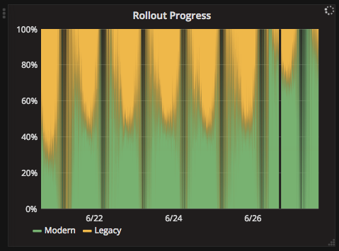
The default interval (1 minute)
An overridden interval of 1 hour
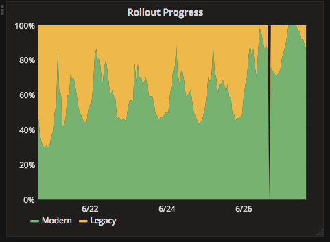
Trends in the data can be made more obvious by viewing it at a different level of detail.
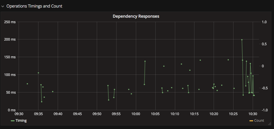
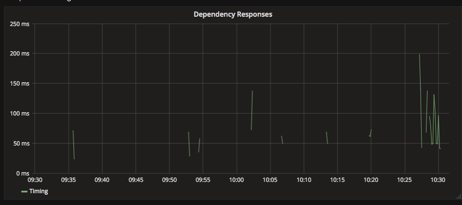
2. Use Points Draw Mode to make sparse data more visible
On sparse data, data points can appear as lines of zero length and be completely invisible. Enable the Points draw mode to make isolated stats stand out.
I recommend a width of 1 to ensure that the points merely point the data out and do not blend together, hiding the true data.
3. Repeat panels and graphs for similar data
Standardise your stats, then use repeated Panels for repeated stat types. e.g. for each dependency, show timings, counts and errors.
You can use template variables to create a list of options (even discover the available stats from your graphs), then configure a graph or panel to repeat for each item in the list.
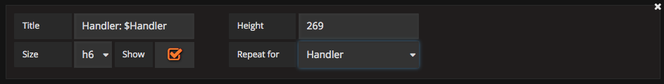
Maintaining duplicate graphs will just give you a headache.
4. Share Snapshots
Dashboards and their data are changing all the time. If you share a link to a dashboard, the graphs may be changed or the data may be archived or reaggregated in future, meaning that your link may no longer show the information you wanted to share.
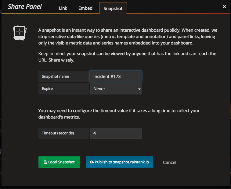
Share a snapshot instead. Grafana will store your data and protect it from change so that it can be referenced from documentation or incident management with confidence.
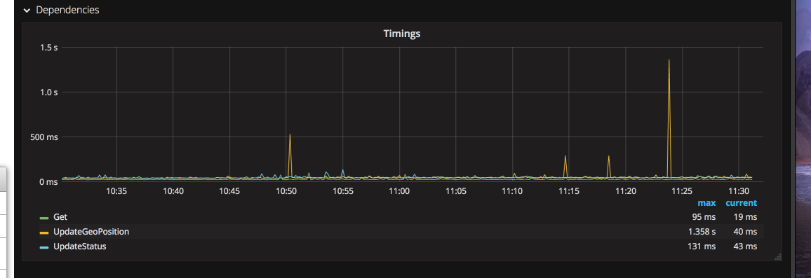
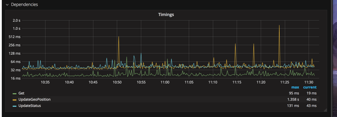
5. Use non-linear scale for timings to make highly variable data understandable
Linear scale on the Y axis can often hide data. Outliers can cause the fine detail of the data to be invisible.
Using Log2 as the scale for the same data shows that the different data series are not exactly the same, and that smaller, but still significant spikes are more common.
Graphite
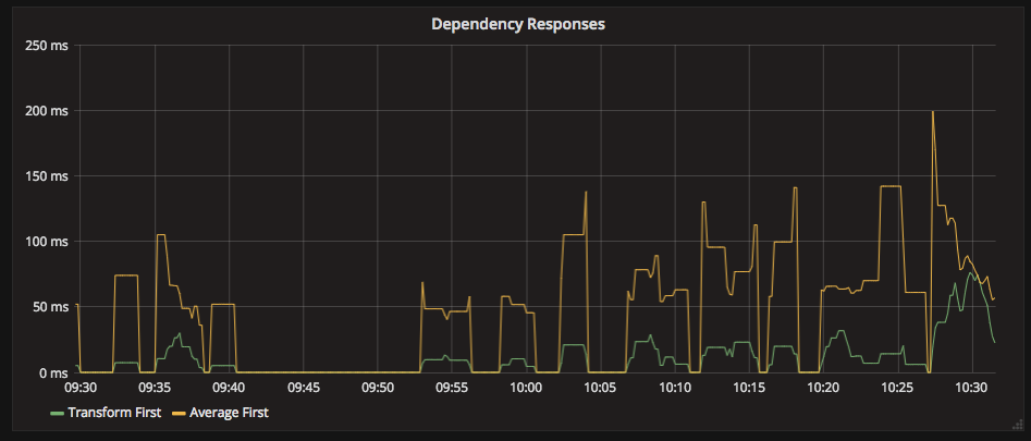
1. Never transform null timings to zero
In a sparse data set, it’s tempting to guarantee that your data does not have huge gaps in it. When counting a stat, e.g. requests per second, a gap in the data means that you got no requests. In this case applying transformNull(0) makes sense, filling in the gaps in the visualisation.
Applying this function to timings, however is positively misleading. It would give the impression that, for periods of time, the timings were 0.
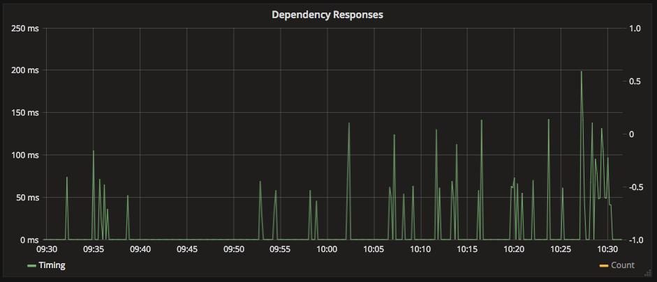
It now appears that our timings are very spiky and unreliable, which might not be the case.
A gap in latency stats does NOT mean that the latency was 0. It means that no data was available. The gaps in the visualisation tell us that we are not able to answer any questions during that period.
Omitting transformNull(0) from timing graphs highlights the present and absence of data much more clearly.
Lack of data should not be hidden. Think carefully before transforming data to ensure that the transformation does not obscure the meaning of the data. Graphs are about making information visible, not hiding it.
2. Applying transformNull(0) before aggregation changes the meaning of the aggregation
If you do choose to use transformNull(0), do so before movingAvg(), movingMedian(), or other aggregate functions, otherwise the aggregations will not include the transformed data.
3. Always specify your units
Always specify the unit of time, e.g. summarise(), movingAverage(), the default is the number of data points included.
On sparse data, the last N data points may be 100 seconds or 100 minutes, you won’t know unless you double check the graphs generated against the source data.
Useful links:
Comments